Case studies
/

Branding for CFT®

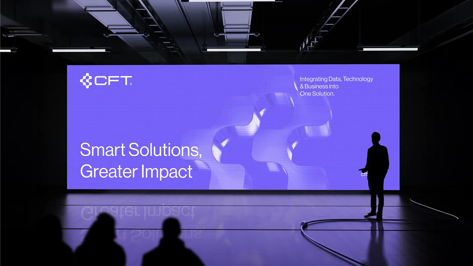
CFT: “Smart Solutions, Greater Impact” tagline on a stage screen

CFT Europe

Data is like a company’s bloodstream. A smooth, uninterrupted flow keeps the whole business healthy. For a company to grow, there can be no room for blockages, faulty processes or bottlenecks.

With our in-depth industry knowledge, a forward-thinking approach to processes and modern IT solutions, we keep data flowing without disruption. That takes business operations to the next level. Our mission is to help insurance companies reach their goals by delivering well-thought-out, personalized, high-quality IT services.
We act as partners, not vendors.
That lets us build solutions that make a real difference.

Branding
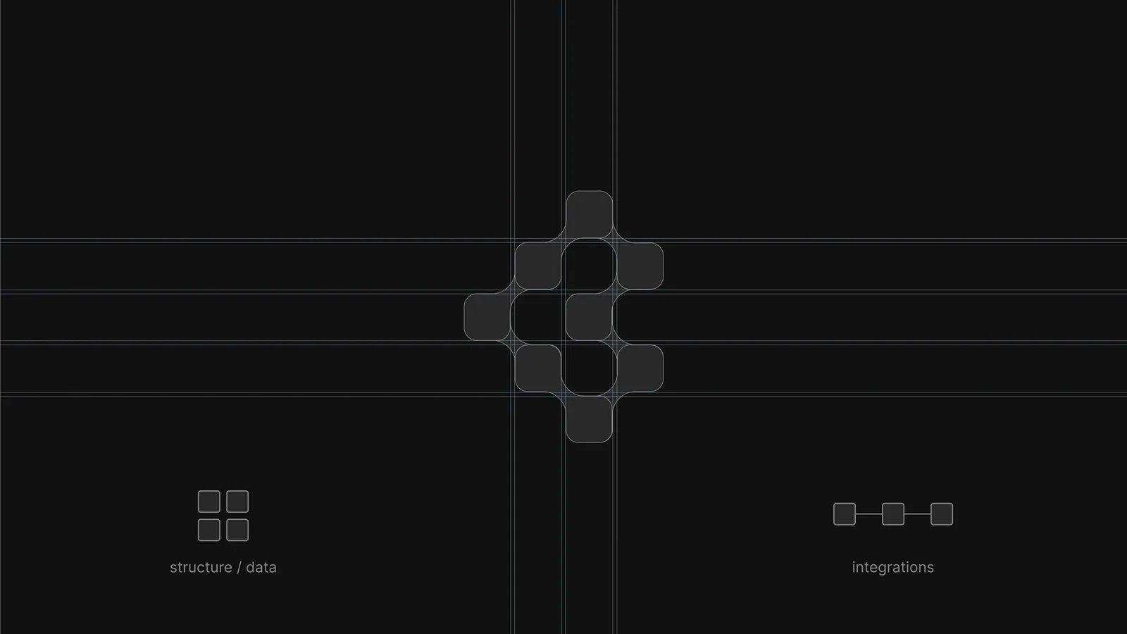
CFT: logo construction on a modular grid
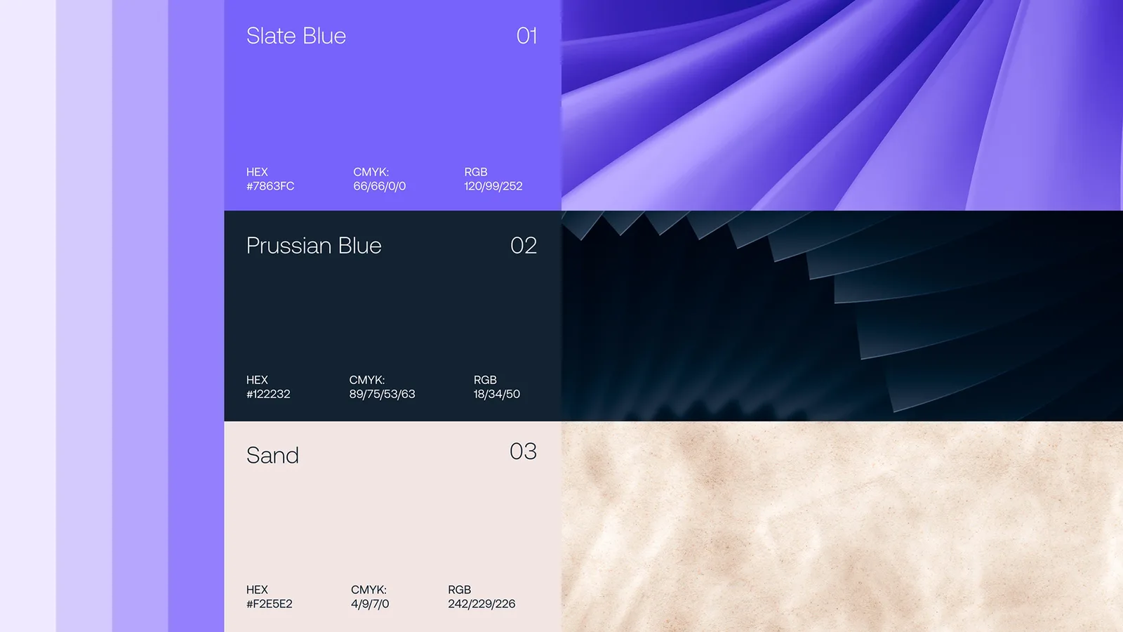
CFT: color palette with Slate Blue, Prussian Blue and Sand
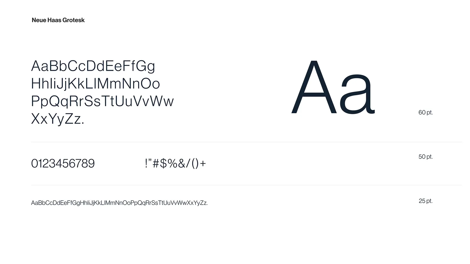
CFT: Neue Haas Grotesk typeface
01 · Identity

Visual concept

The visual identity concept for CFT is built on the metaphor of data flow as a key element of a smoothly running business. The visual system uses modular, organic 3D forms that symbolize the integration of technology, data and processes into one coherent ecosystem.

Soft, fluid shapes are set against the orderly structure of the layouts, striking a balance between flexible solutions and technological precision. A color palette of purples, navy blues and neutral tones underscores the brand’s forward-looking yet stable character.

Nazwa metryki
Opis metryki
+100%
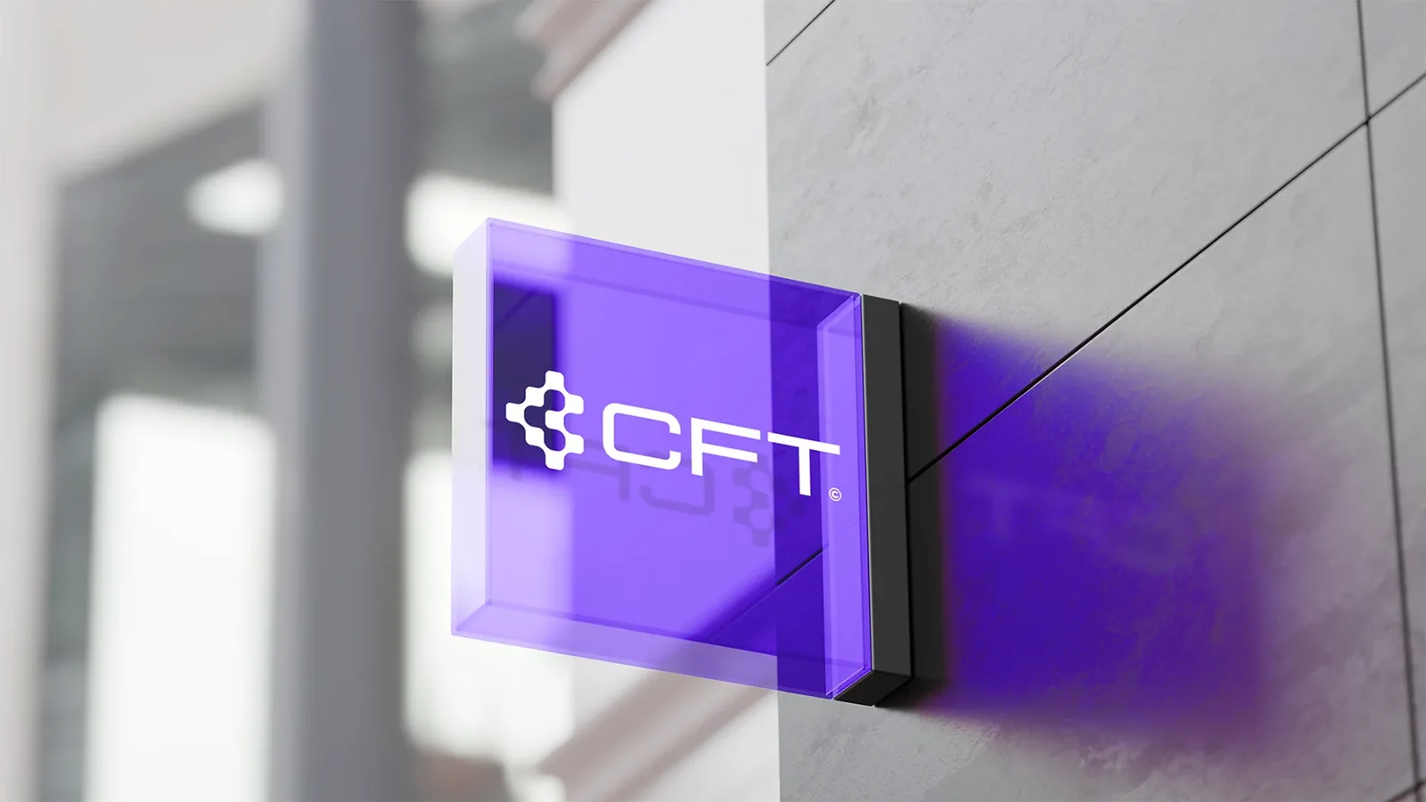
CFT: illuminated logo sign on a building facade
CFT: business cards in the new identity
CFT: posters at an event venue
CFT: large-format billboard on a building
02 · Rollout

Applications and scalability

We designed the identity as a flexible, scalable system, ready to use across many brand touchpoints. It covers areas such as:

  • digital communication and social media,
  • print and corporate materials,
  • event branding, outdoor and large-format media.

The modular structure keeps the visuals consistent, whatever the format or scale.

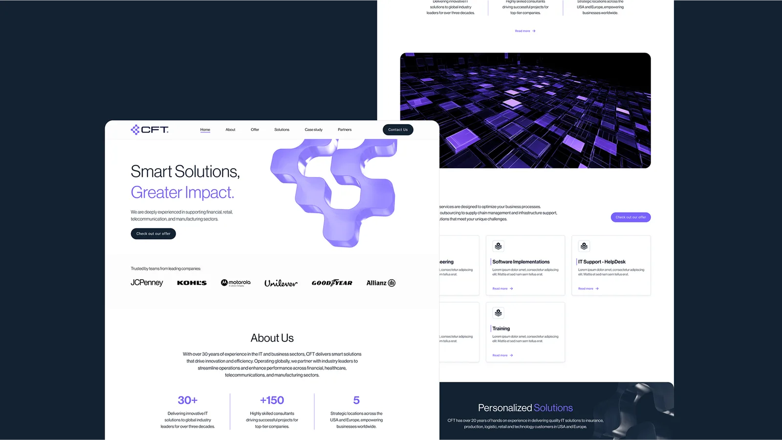
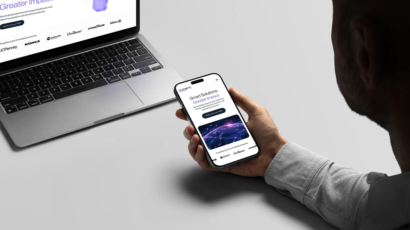
CFT: website on a laptop
CFT: website screens
CFT: website on mobile and desktop
03 · Brand language

Typography and messaging

The type system is built on Neue Haas Grotesk, a legible, modern and neutral typeface that reinforces the brand’s professional tone. Typography brings order and supports clear communication, even in complex, information-heavy contexts.

The tagline “Smart Solutions, Greater Impact” is at the heart of the brand narrative. It highlights the brand’s focus on real business impact rather than on technology itself.

01
Tytuł karty
Opis karty
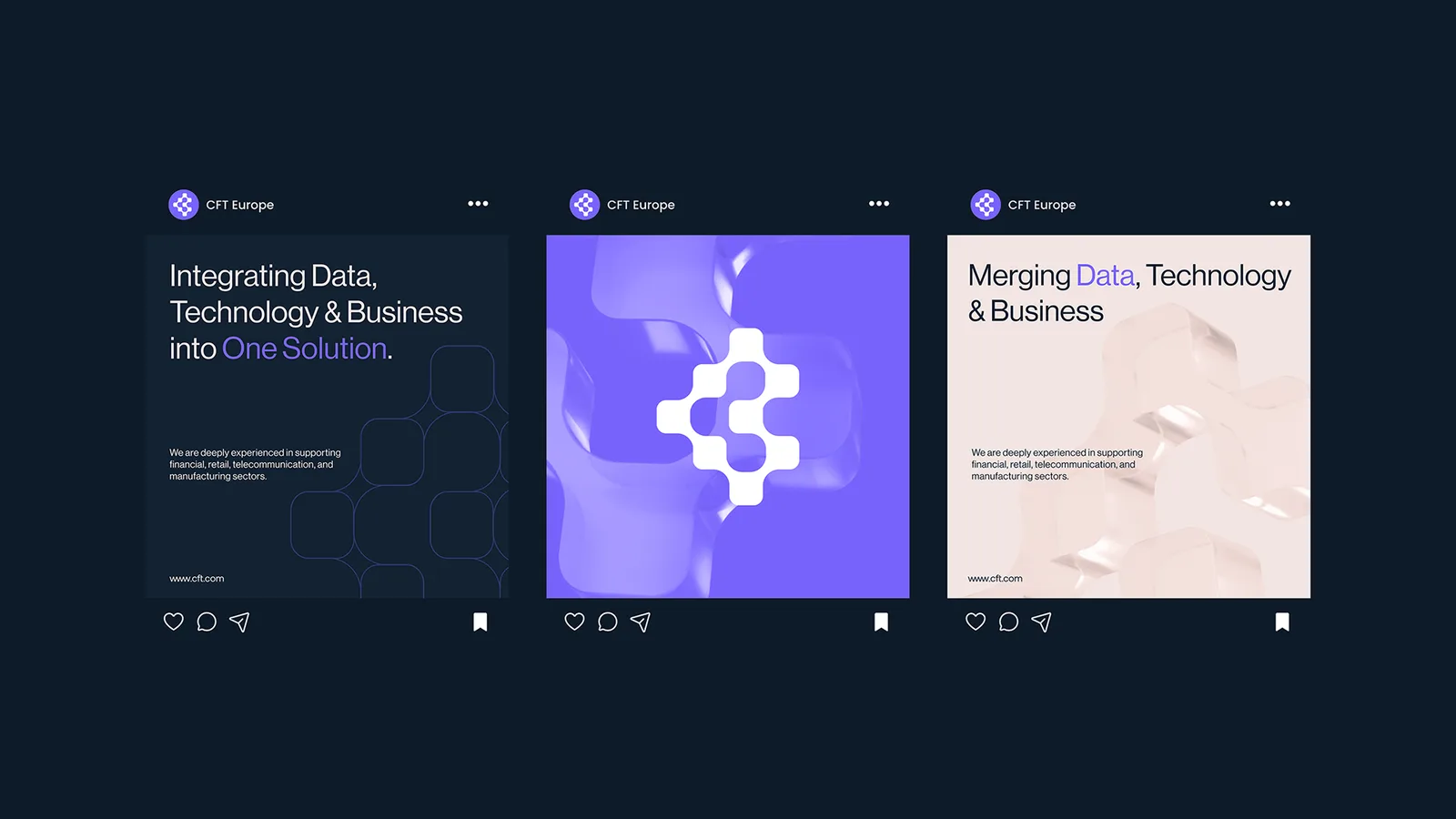
CFT: social media posts
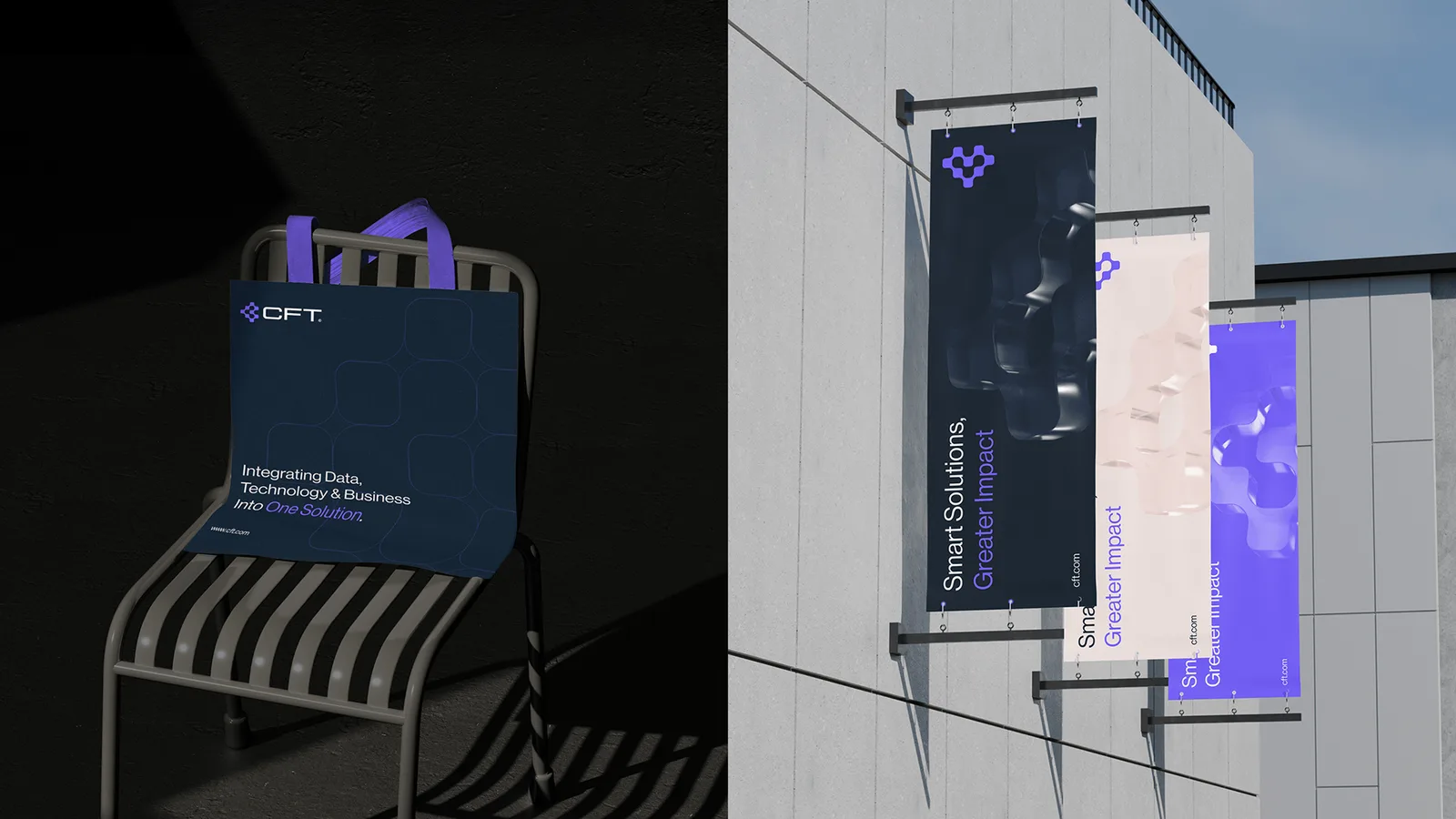
CFT: branded bag and flags
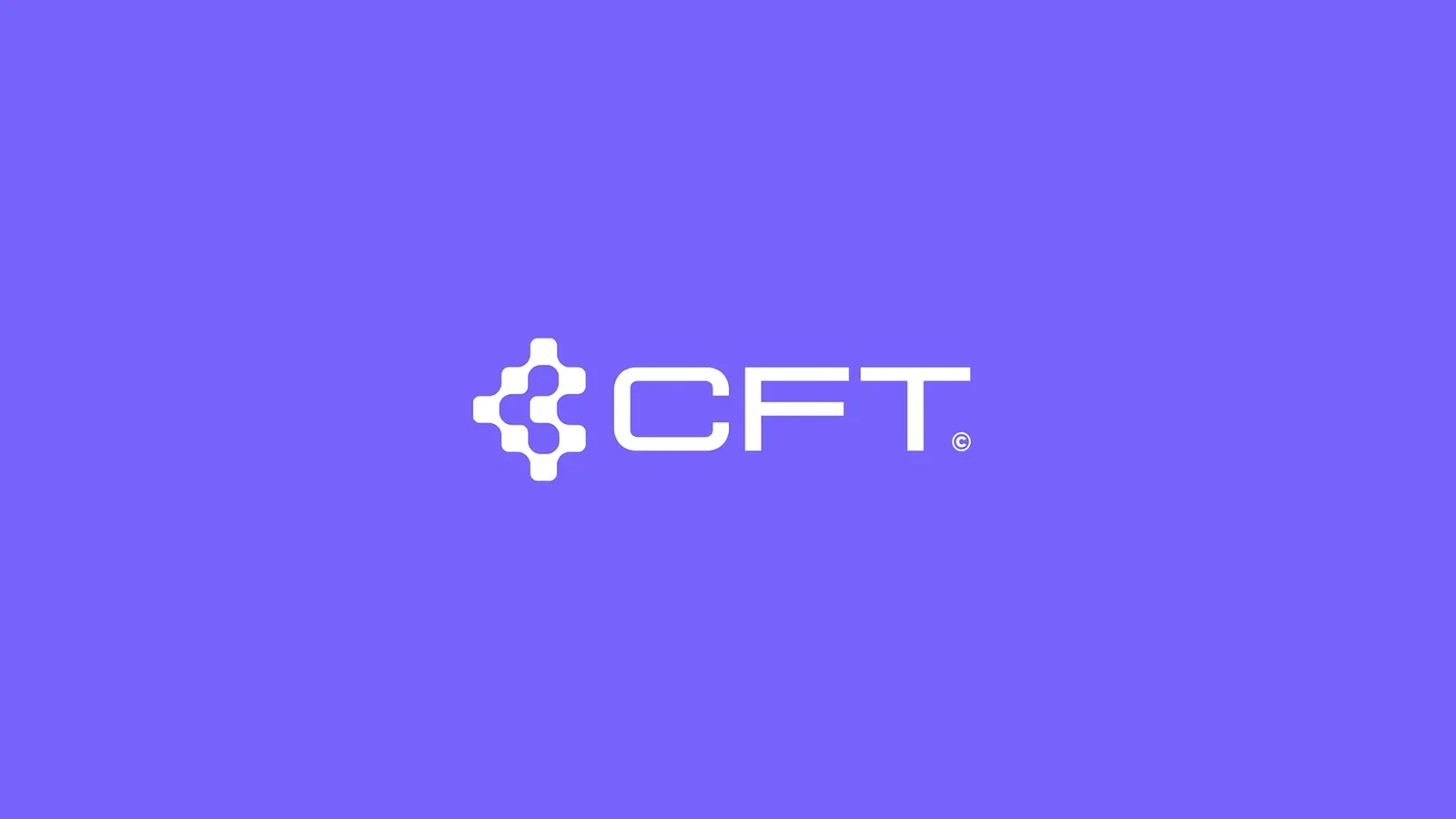
CFT: logo on a purple background
04 · New brand image

Outcome

The new visual identity positions CFT as a mature technology partner that simplifies complex processes and brings data, technology and business together into one coherent system. The design supports the brand strategy and builds the image of a modern, trustworthy company focused on real impact.

Źródło
★★★★★
5,0
Treść opinii klienta (wypełnia się z pola „o · opinia”).
Imię i nazwisko
Stanowisko, firma

Write to us or book a call

Done. The ball’s in our court. We’ll get back to you soon.
Something went wrong. Please try again.
or
Book a call