Gazomet operates in the gas industry. We designed a visual identity that highlights the company’s professionalism and know-how: a new logo, a key visual and a full set of materials.
Real technical drawings and minimalist graphic elements signal quality and reliable knowledge sharing.
Client: Gazomet, gas industry
Scope: logo, key visual, branded materials, social media graphics

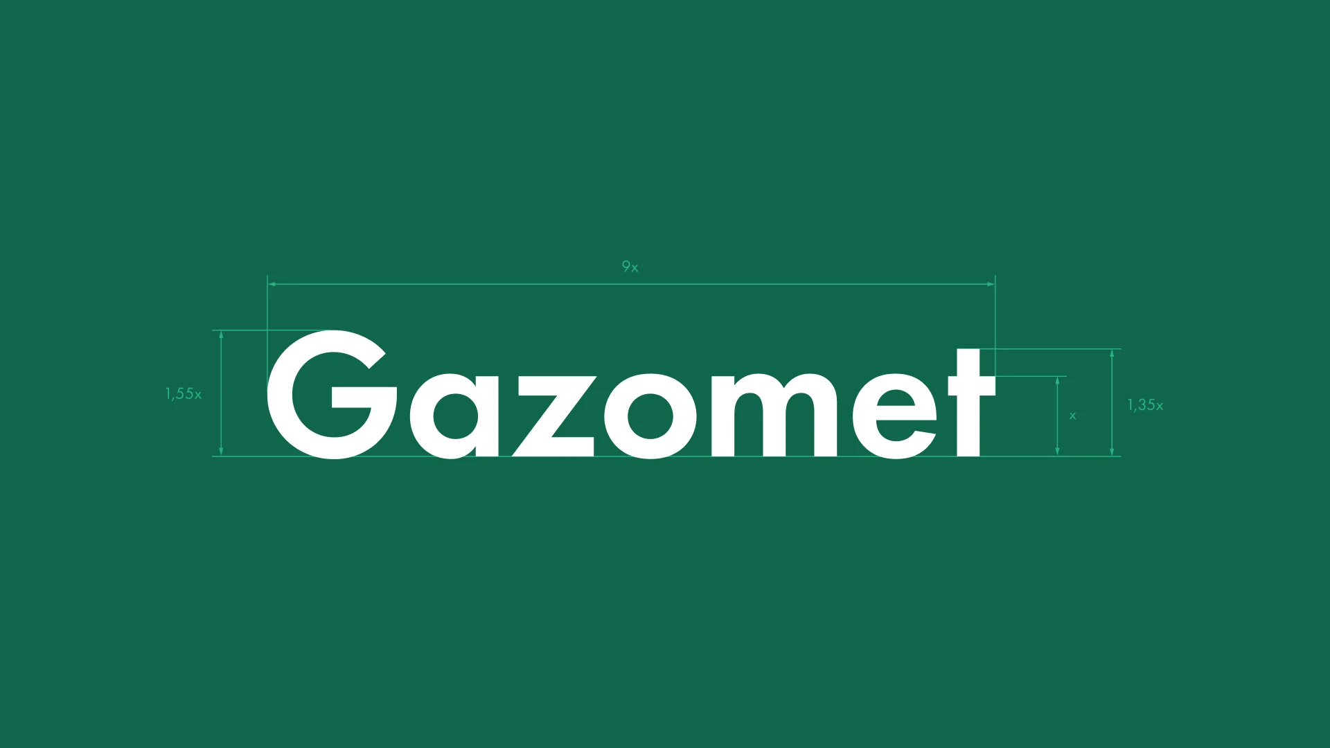
The new mark is a restrained, geometric logotype with no symbol or ornamentation. We show its construction in the language of technical drawing, just like the rest of the identity.
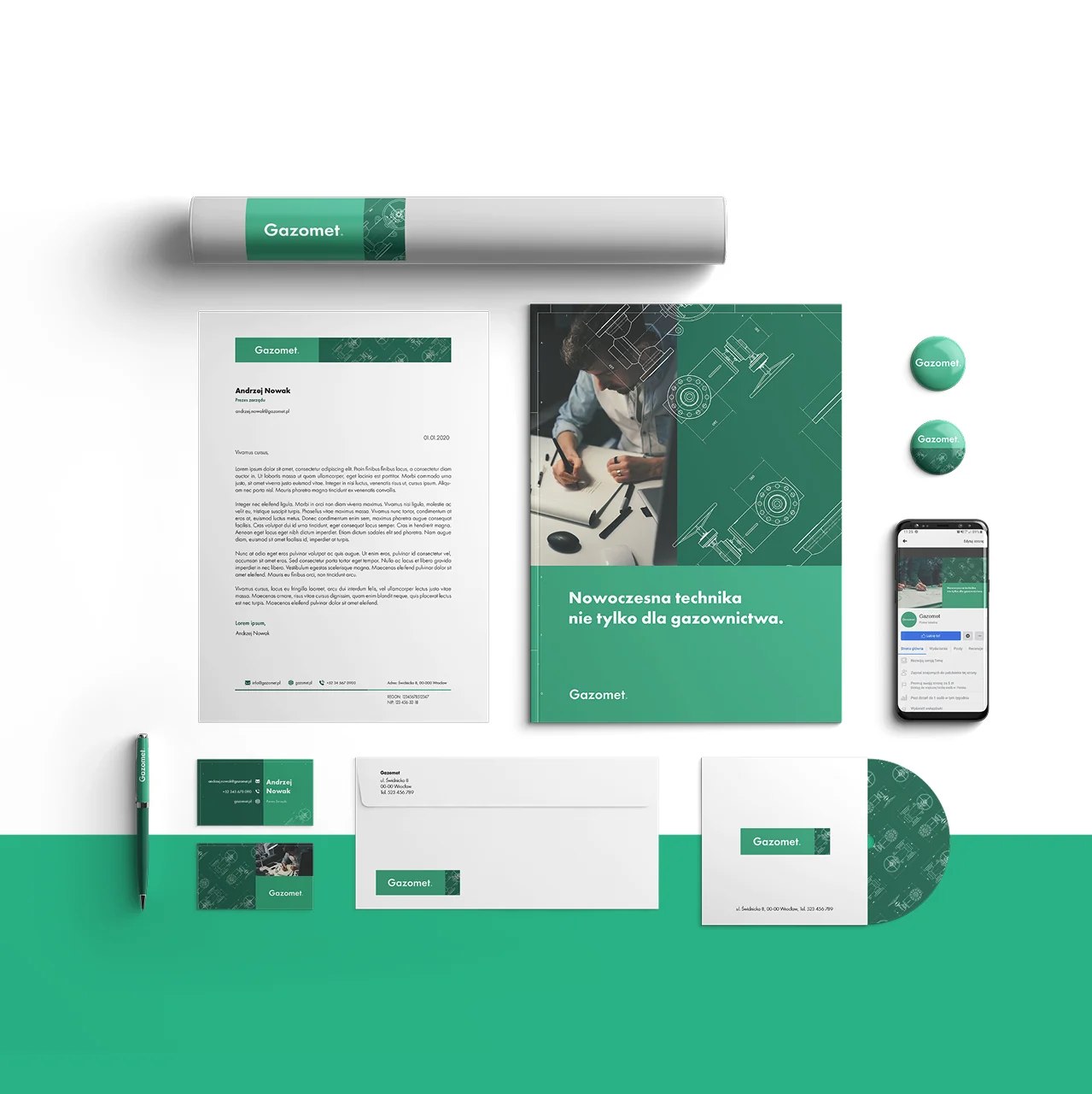
The mark works on the brand green, on photos and on branded materials, from a pen to the brochure cover.


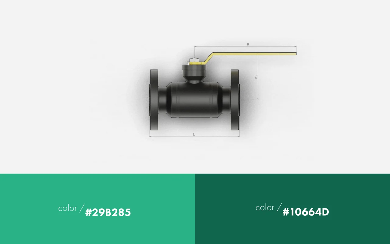
We built the palette on two greens, deep and mint, and the typography on a simple, geometric sans serif. A pattern made from real technical drawings of valves works on both green and white.
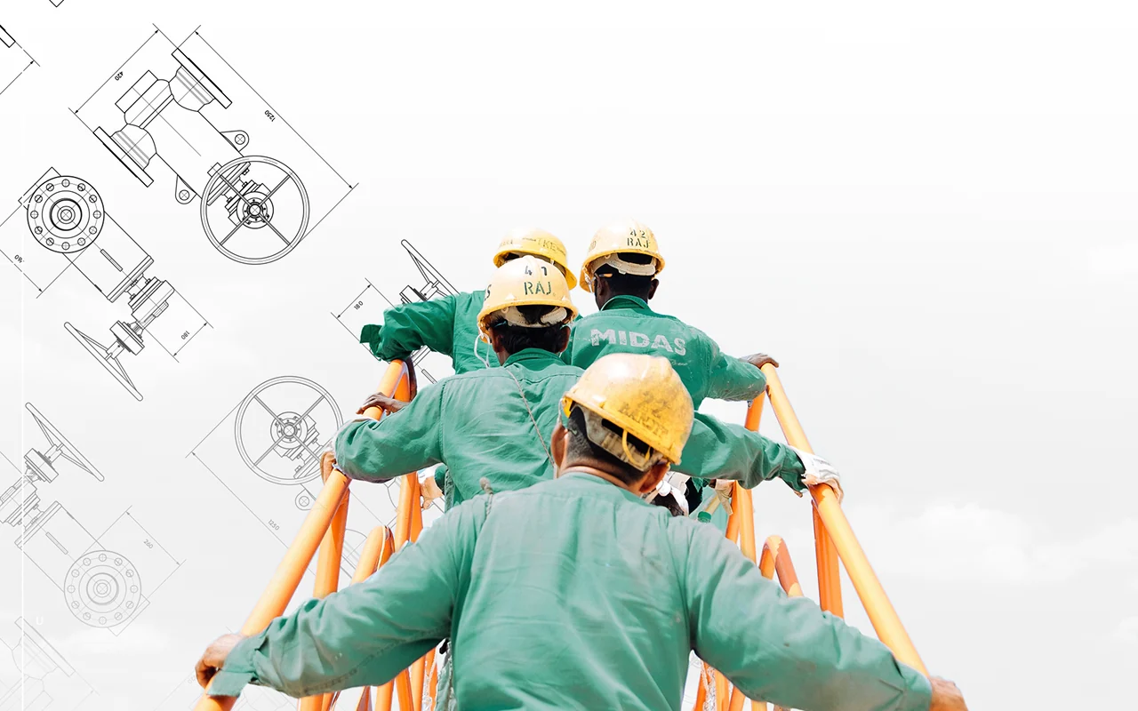
The key visual combines technical drawing with photography: the lines of valves and flanges overlay photos of people at work and product renders. That way, the brand shows its know-how instead of talking about it.

We carried the identity over to a full set of materials: letterhead, envelopes, business cards, a drawing tube, pins and a brochure with the tagline “Modern technology, not just for the gas industry.” We also applied it to the brand’s social media profile.