Vazco delivers solutions from A to Z and often takes the helm of its clients’ projects.
The rebranding was a complex task. Put simply, it took five steps: a workshop, strategy, logo, branding and website design. The common thread is a nautical theme, chosen at the workshop and strategy stage.
Client: Vazco, a software house in Wrocław
Scope: strategy, branding, website design


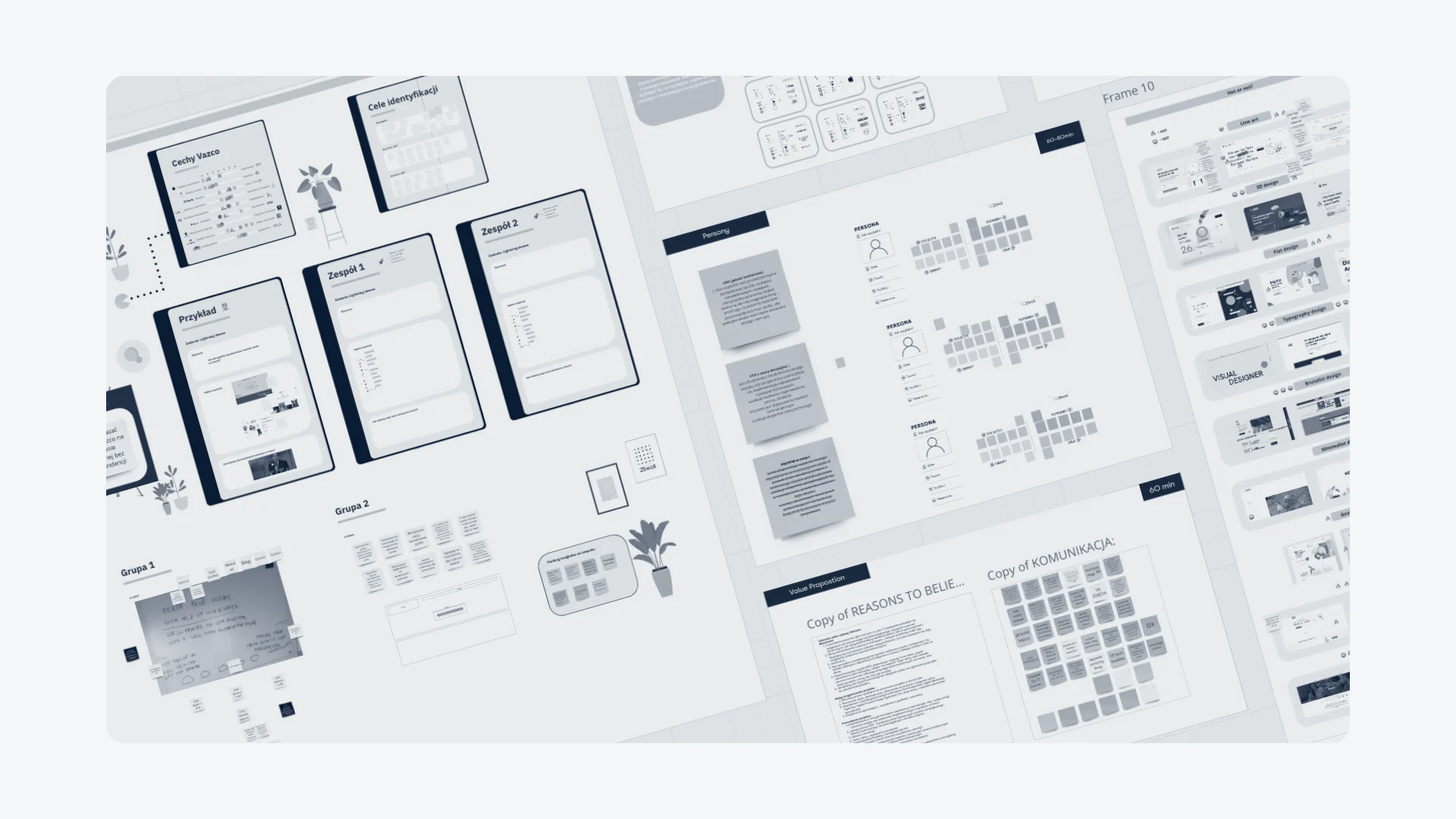
We started with a workshop. We took a close look at the brand’s current image and discussed possible directions for its growth. On the board, we mapped out the brand’s traits, identity goals, personas and value proposition.
After a few iterations, we settled on a nautical theme. It then runs through the logo, the identity and the illustrations on the website.


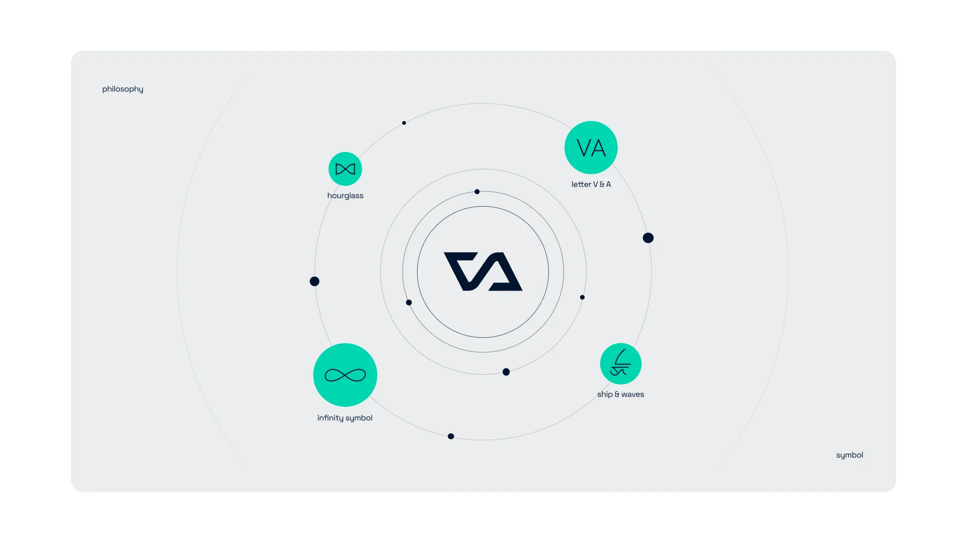
We experimented a lot with the logomark. The goal: a timeless logo with a story to tell. A single shape brings together:


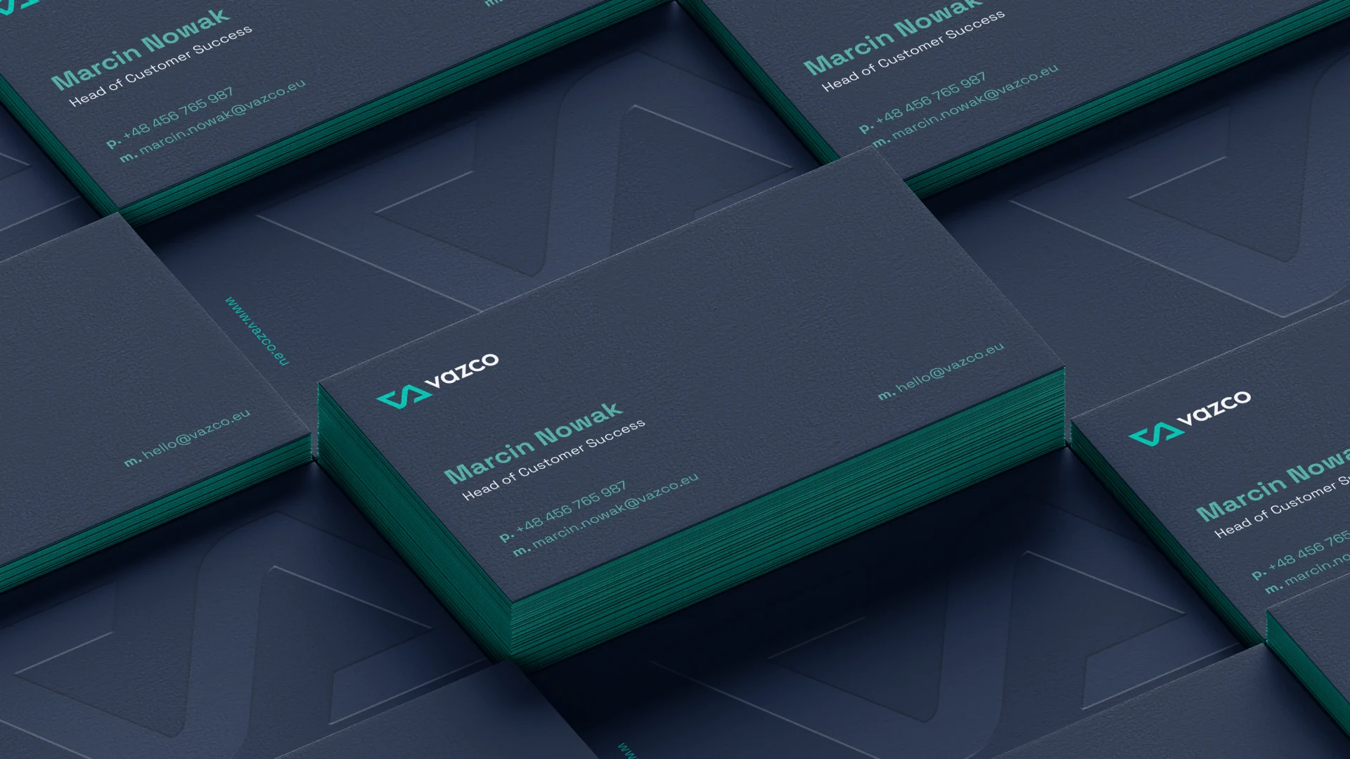
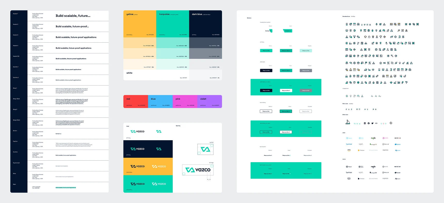
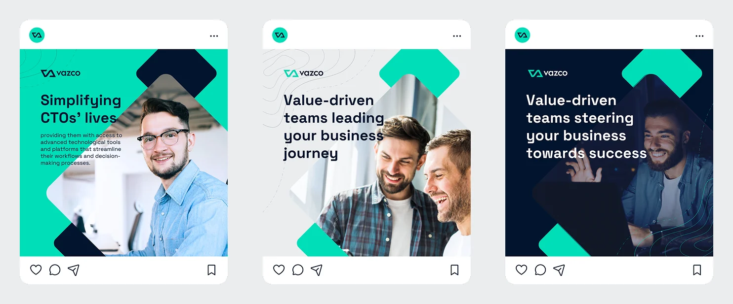
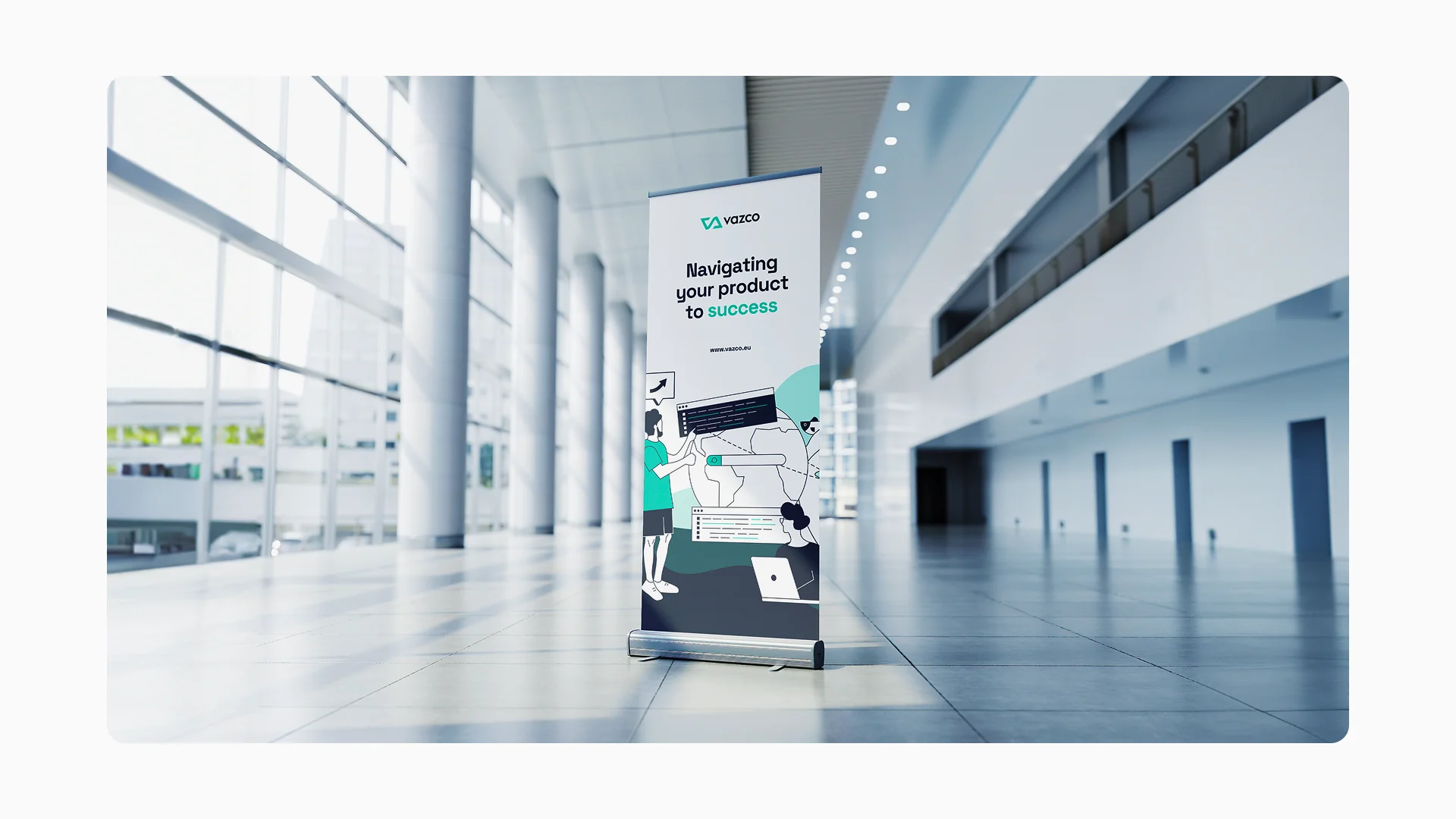
The identity relies on a restrained mix of brand colors (navy, turquoise and yellow) and on elements that subtly reference the sea. To keep the materials from being carbon copies of each other, we use:
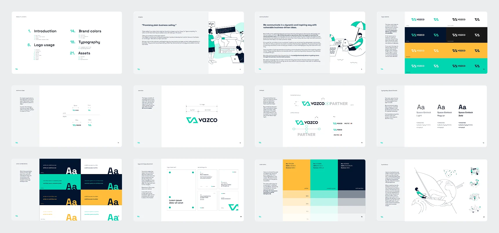
It all comes together in a brand book: logo, colors, Space Grotesk typography and graphic assets.


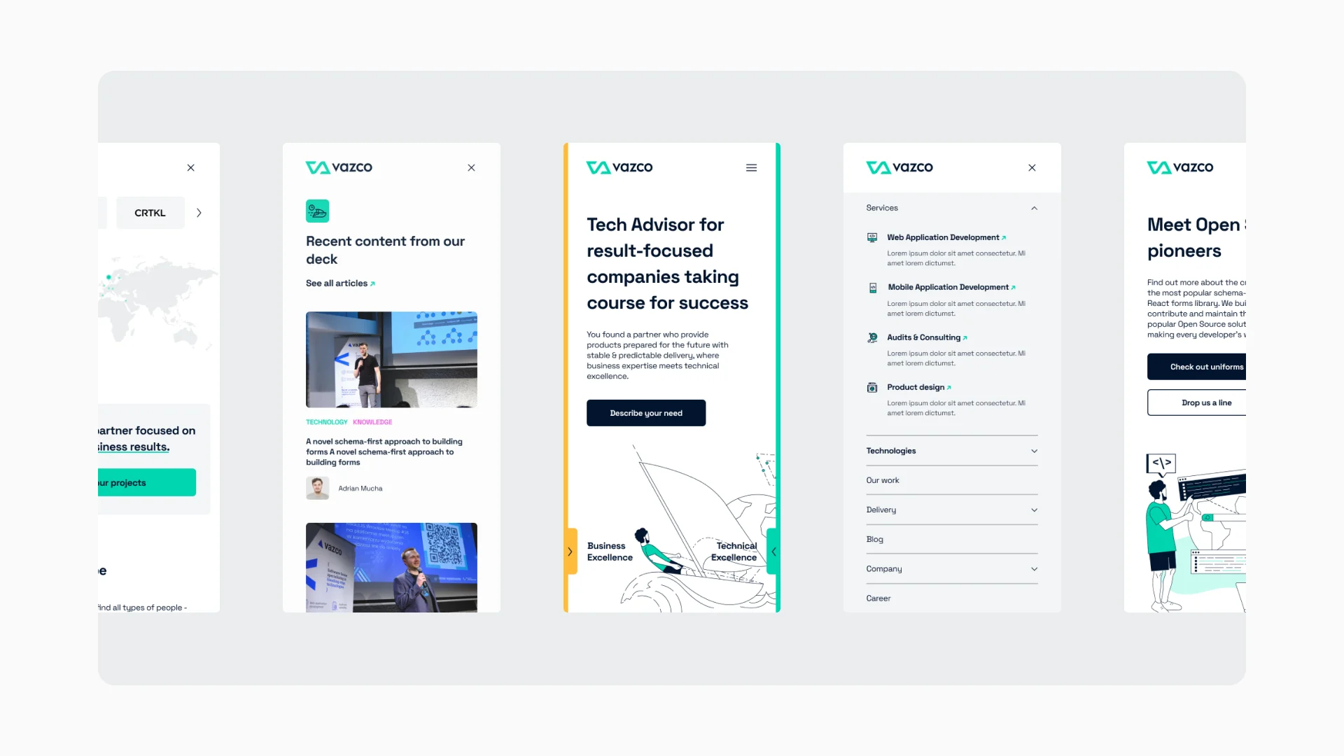
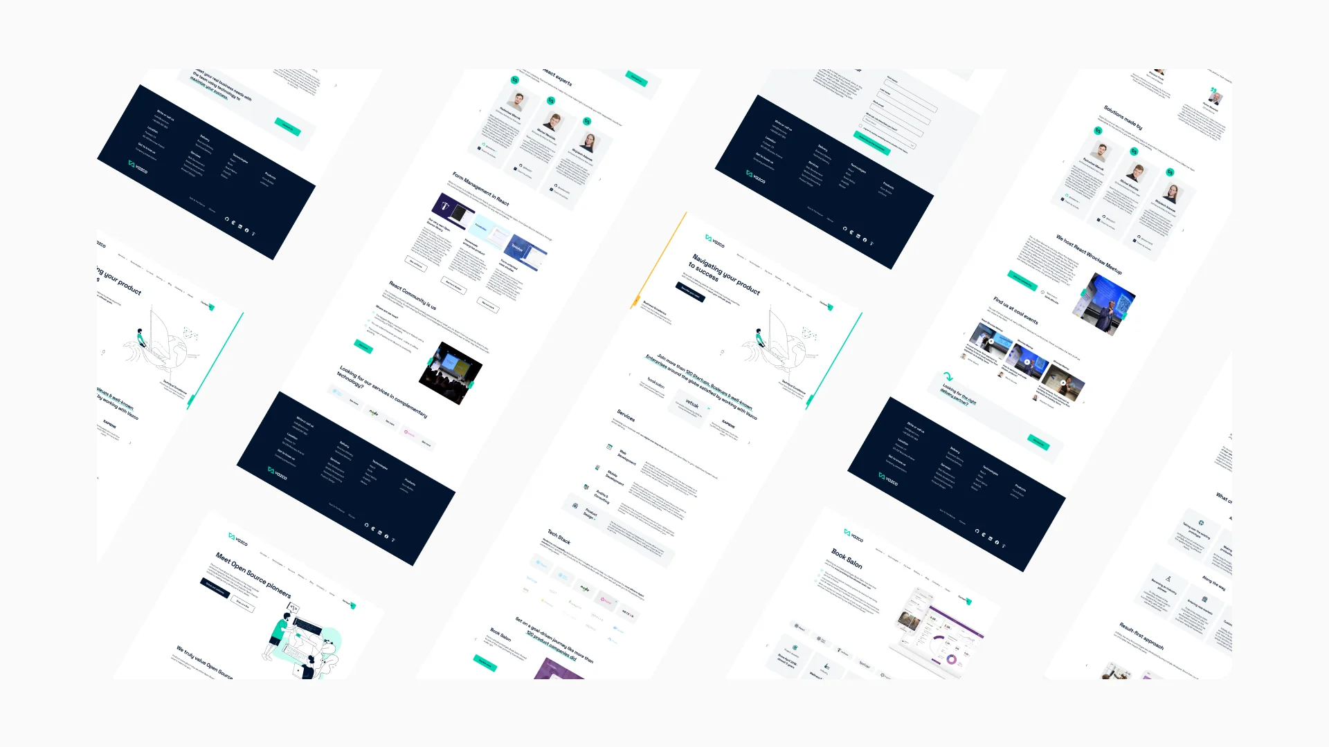
We designed the website to be minimal and modular, so content is easy to organize and the site is easy to navigate.
The standout: custom illustrations. The drawings enrich the visual layer and give the whole site a shared motif.