Is it time to change your company’s image? Rebranding and a new key visual
Is it time to change your company’s image? Rebranding and a new key visual
Branding
10 min read
Table of contents
TL;DR – w skrócie
Rebranding is a deep change to a brand: its strategy, communication and image. A new key visual can be part of it, but on its own it’s only a refresh.
The most common reasons to rebrand: an outdated look, a change in marketing strategy, a poorly captured company personality, a reputation crisis, plus acquisitions and mergers.
If you just need a fresher look, a new key visual is enough. If your company’s direction is changing, plan a full rebrand.
OLX, Xiaomi and Vazco (a 25wat project) show different scales of change, from a subtle evolution of the mark to a strategic brand transformation.
We admire brands that have been around, and thriving, for decades. They’ve been here, they’re here now and they’ll likely stay, because they keep changing and adapting to circumstances. Maybe they simply know that, at some point, it’s time for a new image, time for a company rebrand?
Are there moments when a bigger or smaller change to a company’s image is unavoidable? According to Patryk Sowa, Visual Designer at 25wat, there are at least a few situations in which it’s a good decision—and sometimes the only possible one.
To start: what is rebranding and what is a key visual?
Rebranding is a change to a brand’s existing image. It’s not only about modifying the visual identity, though. Above all, it’s a deeper internal transformation of the brand, and the graphic changes are the outward expression of it.
When a company decides to transform elements such as its key visual, logo, logotype or naming (the name itself), today’s customers often see it as a sign that the company is evolving and something inside it is changing. The new image is the symbol of that change.
Definition: a key visual is a brand’s graphic motif, made up of elements such as typography, color (or colors), layout, photos, icons and illustrations. What’s it for? It should set the company apart from the competition and help customers recognize the brand (which is why it appears on all advertising materials, staff uniforms and company cars, among other places). A key visual should be unique, distinctive and consistent. It should also convey the values that guide the brand and evoke the right emotions in its target audience. A key visual is part of a rebrand.
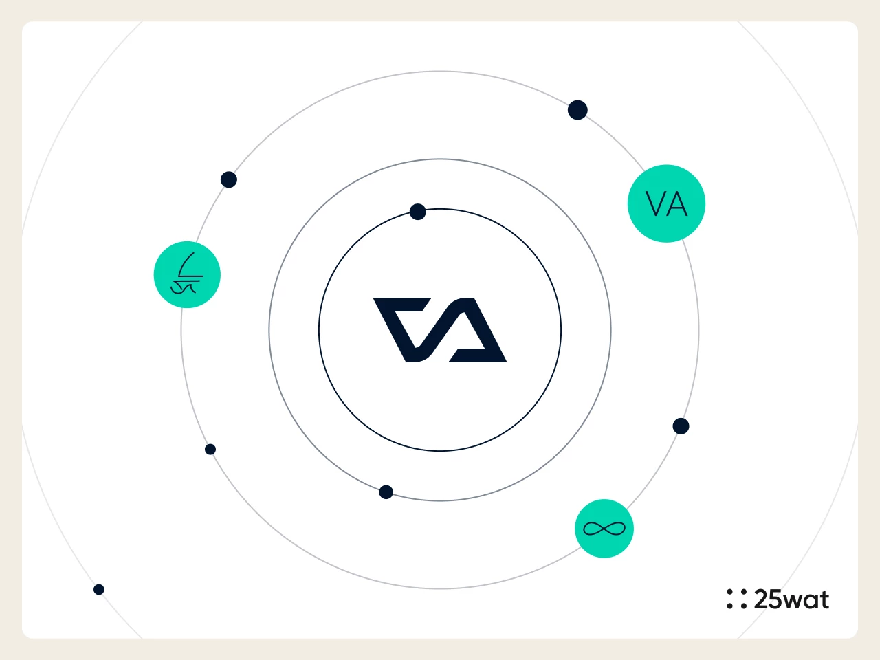
New key visual for Vazco, designed by 25wat
When should you rebrand and change your key visual?
Refreshing a company’s graphic motif, or simply modernizing it, doesn’t mean the organization has gone through a full rebrand. Of course, nothing stops you from changing your key visual to one that better fits your brand’s values or stands out more from the competition. After all, that’s also a way to reach customers and stick in their minds. Changing your image along with a shift in your company’s business direction is a far more complex process than simply retouching graphics.
When do your logo and your company need a rebrand? Here are the most common situations:
An outdated look and way of communicating with customers. Dated graphics, colors and fonts, an archaic design, communication that doesn’t match customers’ aesthetic and technological expectations: all of this has to change if the company is to stay in business. For example: the company’s logo and entire visual identity were created in the 1990s. They don’t fit the aesthetic sensibilities of today’s customers, and they don’t work on social media. The company’s communication design differs sharply from what competitors offer. As a result, the business isn’t very attractive to customers. Its look and actions also give potential employees the wrong idea about the company’s health and strategy. A new key visual is especially important when a company decides to go digital and its current graphic motif isn’t suited to that, or wasn’t designed for online communication. (If the change is only about modernizing the logo, refreshing the key visual is enough.)
A change in marketing strategy. If a company is going through an evolution or a revolution (redefining its sales, overhauling its offering, digitizing its services, changing its customer profile and so on), a new visual expression of the brand is a way to reinforce the message about that transformation. The new look makes visible what’s happening inside the company and shows customers where the changes are heading.
A poorly captured company personality. Sometimes the original branding wasn’t done right, so the company’s offering misses the customers it wants to reach. The brand’s visual image gets misread. That can hurt both sales and image goals. To prevent this, the brand has to be rebuilt from the ground up.
A reputation crisis or a communication crisis. When a company has been discredited and has lost people’s trust, it needs deep changes if it wants to survive in the market. A new look and a new strategy are a way to break away from negative associations.
Acquisitions, mergers, partnerships. These are situations in which a new business entity is created or a smaller company is absorbed by a market giant. In that case, the smaller company takes on the image of the larger one.
If a company needs a quick image refresh, updating the key visual is enough. But if the changes will affect sales strategy, customer communication or communication inside the organization, and the goal is a strategic transformation rather than just a visual makeover, a rebrand is worth it.
Finally: examples of rebrands and new key visuals
What does this look like in practice? How do brands change their image? Here are some interesting examples of transformed visual identities:
OLX. This is already the second rebrand in the platform’s history. The first was in 2014, when the classifieds site changed its name from tablica.pl to OLX. The second round was less of a breakthrough. The site’s visual design and the brand’s logo were refreshed. The key visual was replaced with a much more modern one. The bright colors, which made the brand read as aimed at younger users, were dropped. The design team went with shades of graphite and blue. Now the brand comes across as more mature. The refreshed branding emphasizes the philosophy behind the new identity, which is meant to suggest the ability to make a smart choice. You can see it in the logo, where the middle “L” seems to separate the “O” and the “X” from each other. That can be read as a nod to exactly this kind of choice: users can pick and choose among the listings.
Xiaomi. In this case, the changes are very subtle. Some people may not even notice them. The main change is that the brand’s symbol is now based on a shape somewhere between a circle and a square. The typography and brand colors were also updated. The designers wanted to make the brand more dynamic and lively without breaking its ties to the previous design. The logo refresh stirred up a lot of emotion. Some said the change was too small and unnecessary, while others called it a natural evolution of the mark.
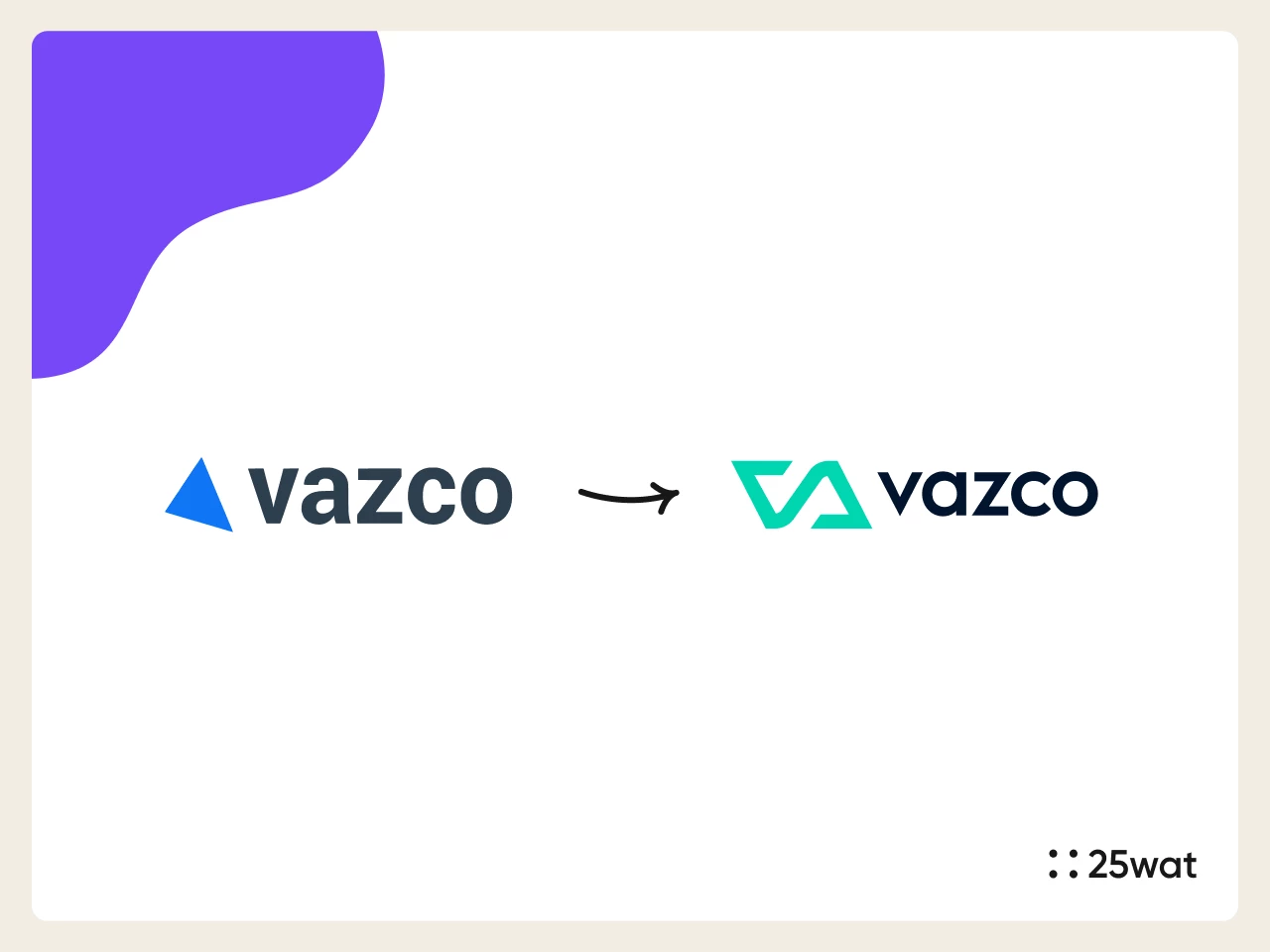
And an example of a rebrand by 25wat: Vazco. It’s a Wrocław software house that delivers comprehensive technology solutions. Vazco’s rebrand was a multi-stage, strategic process based on workshops and an in-depth analysis of the brand. The direction finally chosen was a nautical aesthetic, symbolizing long-term collaboration and a shared journey. We reinforced it with a timeless logo that blends the motifs of infinity, a wave and a ship, along with minimalist branding and a modular web design with custom sea-inspired illustrations.
Vazco rebrand delivered by 25wat
Does your company need a rebrand too? Yes, if you’re facing any of the situations described above. Or maybe there are other reasons? At our creative agency, we know every business has its own story, so we’ll help you decide whether it’s time to change your image. Just ask us.


 Strony WordPress i WooCommerce