5 graphic designer tips: how to create a key visual
5 graphic designer tips: how to create a key visual
Branding
4 min read
Table of contents
TL;DR – w skrócie
A key visual is a graphic motif used across all of a brand’s materials: it should set the brand apart, convey its values and have the potential to grow over the long term.
Start by getting to know the brand (through a strategy workshop or a brief) with the client actively involved, then analyze what you’ve gathered and match your designs to the brand’s main communication channel.
An inspiration board (now virtual, e.g., in FigJam or Miro) and team feedback help you set the aesthetic direction early and check whether the design meets the brief.
When you present, show not only the designs but also the reasoning behind your decisions, such as your choice of typography and colors, and step into the role of the expert.
Stand out, get noticed and stay in customers’ minds. That’s what every brand, manufacturer and service provider wants. And designers make it happen. How? With a key visual.
Want to learn how to create one? Want to check whether your company’s key visual follows good design practice? Read the tips a graphic designer from our team shared in 2021.
What is a key visual?
A key visual is a graphic motif that appears across all advertising and communication materials for a brand or its product, service or event. It should set the company apart from its competitors while conveying its core values and evoking the right emotions in a specific target audience. It should be consistent, distinctive, unique and, as the author of these tips stressed, built to grow:
“A key visual should be designed for long-term use. Even if right now it only needs to promote the brand in digital channels, it should have the potential to grow. That way, it can also work in the future, for example in outdoor advertising.”
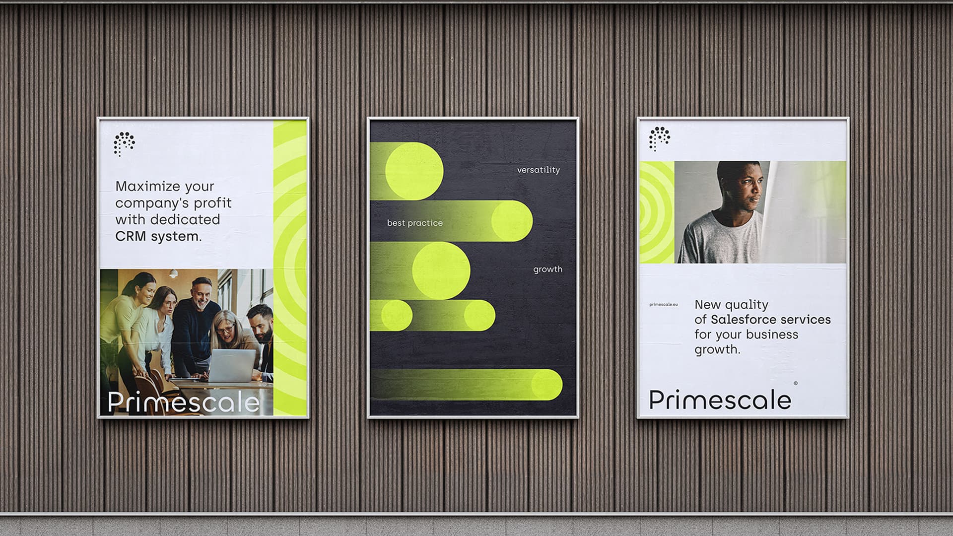
25wat key visual: typography, colors, graphic elements and sample applications
How do you create an effective key visual?
Here are 5 tips from a digital graphic designer at 25wat.
1. Get to know the brand
If we compare creating a key visual to building a house, this stage is like preparing the ground for the foundations. It determines every stage that follows. It defines the form, style and character of the future house.
So if you want to create a key visual for a company, start by getting to know its mission and values, what it sells and who it sells to. Find out what it wants to achieve and what its business goal is. To learn all this, you can run a strategy workshop or put together a brief with the client.
A strategy workshop is an effective way to get to know a brand. Among other things, it helps you pin down what sets the brand apart and what it needs to communicate right now. A brief serves a similar purpose. It also gives you information about the company, gathered through precise, thorough questions.
Important: Tell the client that their involvement at this stage is key to the project. Creating a key visual is a team sport.
2. Analyze the information you’ve gathered
Got the information from the brief or the takeaways from the workshop? Time to analyze it all, draw conclusions, listen closely to what the brand expects and take all the data you’ve collected into account. This is the point where you get to know, among other things, the company’s logo, which is often the deciding clue for the colors, typography and shapes in the key visual design.
Important: Even if your head is full of ideas, focus on what the project actually needs: specific solutions and materials that match the brand’s main way of communicating with its audience. Is bold social media communication meant to be the brand’s strength? Don’t design outdoor materials for it. Show digital graphics instead.
3. Create an inspiration board
Before the best solutions take shape, create a place to capture creative ideas and flashes of inspiration. At 25wat, we call it an inspiration board, and we call this stage ideation: imagination at play. Today we work on virtual boards such as FigJam and Miro. On the board, we capture first sketches, color palettes and style references based on our experience or benchmark research.
Important: With an inspiration board, you can show the client the first results of your work, point to the project’s aesthetic direction and ask them to approve the concept or share suggestions and comments.
4. Get feedback from your team (if possible)
If you have the chance and your agreement with the client allows it, show the design to other people at the agency, such as strategists and social media specialists. A test presentation like this will help you check whether the design meets the brief.
Important: People involved in the project at a strategic level may have valuable comments and thoughts on the aesthetic direction. Their insights may inspire your next visualizations.
5. Prepare to present your idea
When you present the key visual you’ve created, remember that a good presentation includes not only the final designs but also the reasoning behind your design decisions. It’s worth explaining clearly to the client why you chose specific typography or colors.
Important: Don’t be afraid to take on the role of the expert.
A key visual for your brand
At 25wat, we work on a range of visual identity projects. You can see them on Behance or on our website, in the case studies section.
Already have a key visual, but it no longer fits your brand? Find out when it’s worth going for rebranding and a new key visual.


 Strony WordPress i WooCommerce